RESPONSIVE WEB DESIGN |
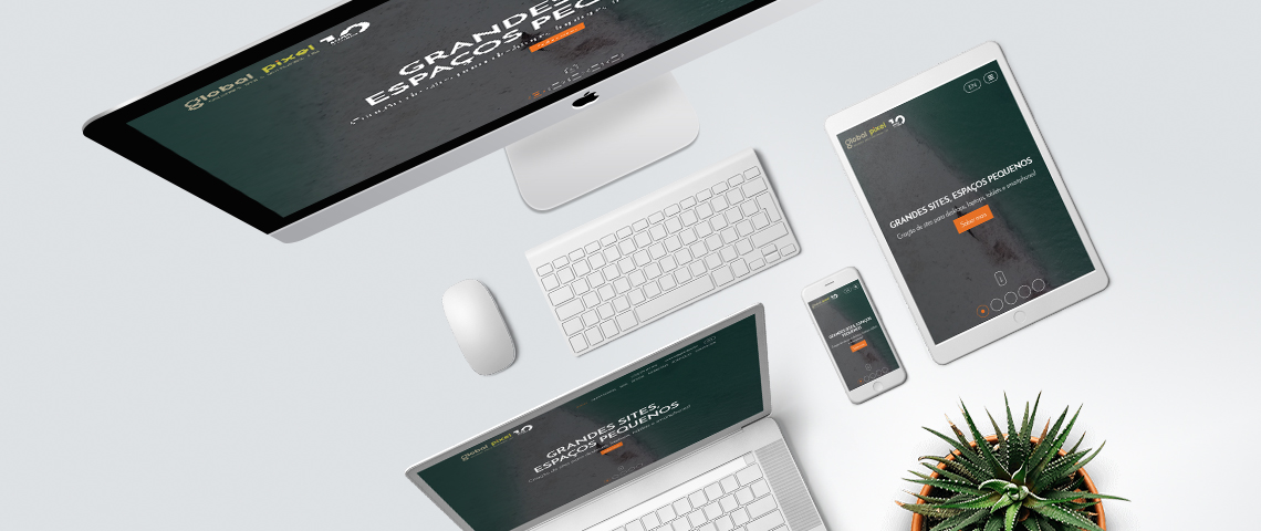
Require that your website or online also will be correctly displayed on mobile devices such as tablets and smartphones!What is responsive web design? Responsive web design is a way or technique for creating websites and online stores that allow them to adapt on the screens and devices on which they are presented, such as desktops, laptops, tablets and smartphones.
Websites that use responsive web design use fluid grids, where all elements of the site are proportionally sized in percentage to the detriment of the pixel, which is a fixed unit of measurement. At Global Pixel, websites and online stores are created with responsive web design, which allows them to adapt to different devices, promoting appropriate usability to their size and format. |